Redesigning Angelucci’s e-commerce website
Overview
Angelucci 20th Century is a furniture store that focuses on vintage mid-century design sourced in Europe as well as the occasional Australian piece. Restored and sold in Melbourne, they also offer a range of contemporary bespoke sofas, butterfly chairs & homewares.
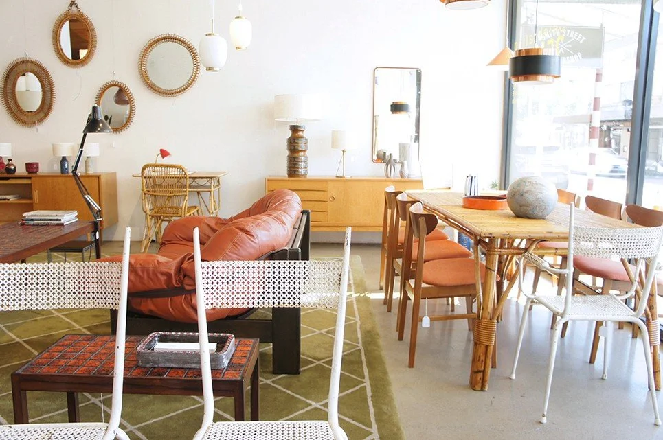
The showroom, ideally situated in trendy Fitzroy, allows for affluent foot traffic and retails an eclectic mix of product. The beauty and calming atmosphere of their showroom is an inviting delight. Walking in, there is an abundance of designs to explore, bringing out the inner treasure hunter in anyone.
Angelucci has a problem:
Their templated website does not reflect the beauty of their curated showroom.
I worked with Angelucci for 2 weeks during a solo assignment at General Assembly to visit the potential of redesigning their online brand to bring it in line with their offline charm.
I carried out the entire project and was independently responsible for everything, from research to prototypes and wireframes.
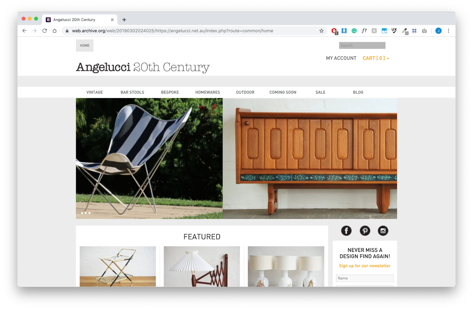
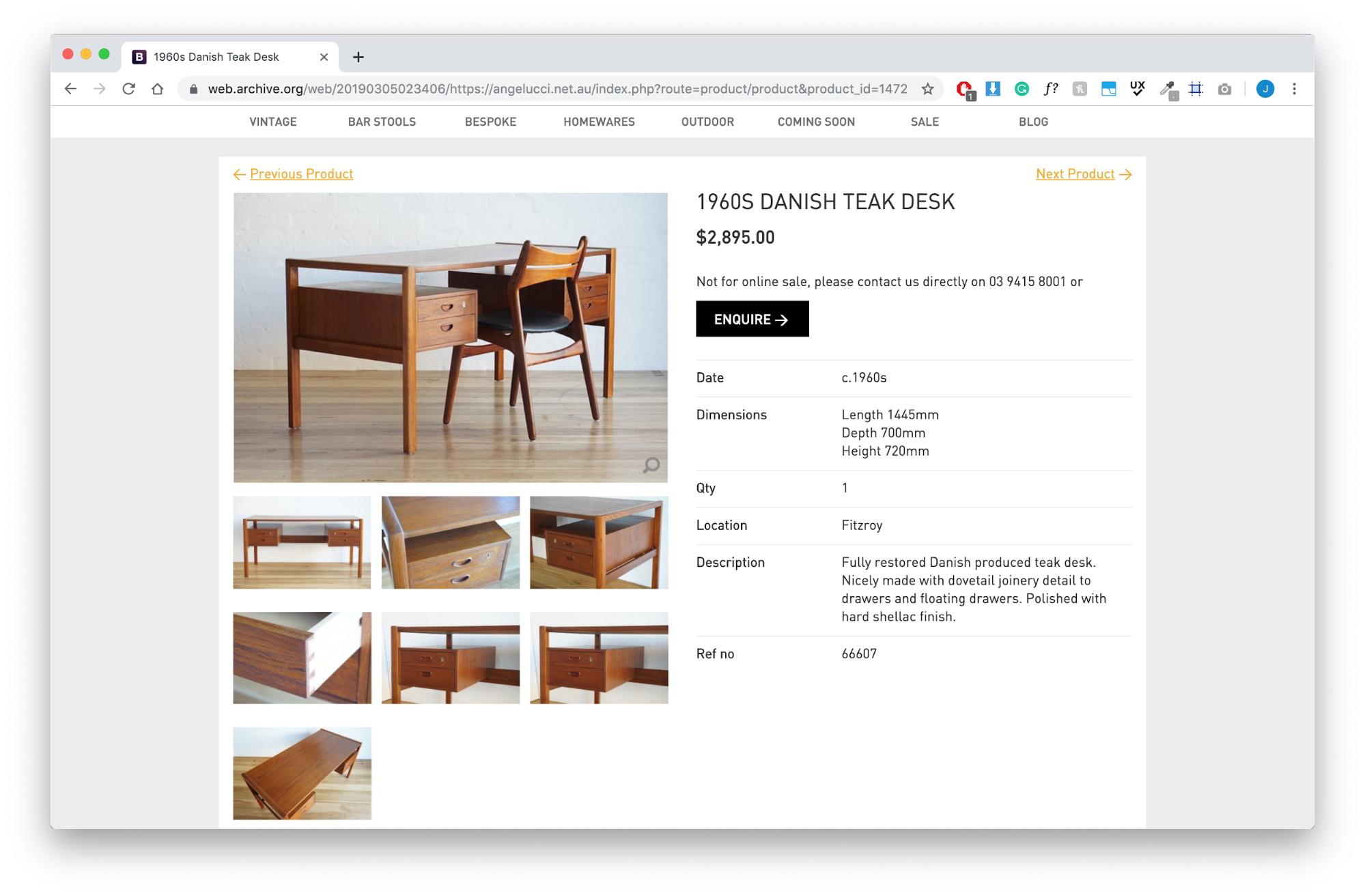
Above: The current Angelucci website does not reflect the beauty of their showroom
Goals + competitors
In a stakeholder interview, I sat down with the front-of-house manager, Alex, to understand the industry Angelucci is marketing in, its strengths, weaknesses, and its opportunities for success.
I found out that Angelucci’s most important goals were to:
provide a unique furnishing offering within the Melbourne market;
provide unique and desirable bespoke lounges;
maintain and grow their customer base.
I went on to compare Angelucci to each of its competitors identified by Alex.
This uncovered some interesting advantages for Angelucci.
Their unique made in Melbourne bespoke lounges.
This is a win for ethically-minded customers conscious about where their stock is sourced but still looking for the quintessential tenets of modernism in a sofa.Their customer experience offering.
Dean, the owner, has been in the business for 25 years. As Alex puts it, “Dean has an unending energy. And knowledge. He’s really quite a fantastic salesperson when you ask him. We have a unique product and Dean has a really good reputation in the industry.” Of course, anyone could say this, but it became evident later when multiple customers reminisced on their interactions with Dean from many years ago. It is clear he provides a memorable service.Their restoration process.
There is a story to be told behind their restoration process and right now, they fall short of giving their customers that narrative. All their vintage pieces are individually selected and lovingly restored locally in their Brunswick warehouse. Care is taken to bring each and every one of these pieces back to life by a team of committed artisans.
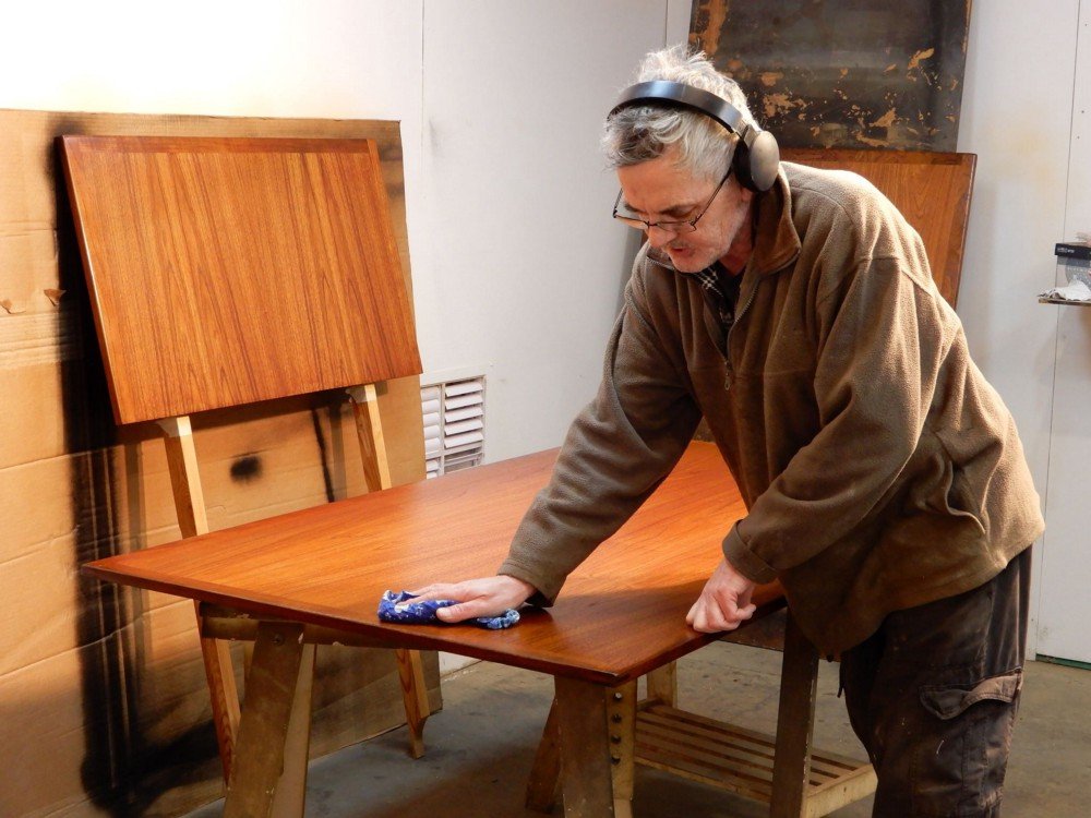
Above: Angelucci’s restoration process is a story worth sharing.
Top insights from user interviews
Talking with customers about their love for mid-century design and its era was something quite special. People were passionate and had many experiences to share. This made for solid research insights.
People love shopping for vintage furniture for 3 reasons:
The story behind each piece.
“Finding that something special and going, Oh wow! That’s an original from the 60s! I wonder what its story is?”
“There’s a story to it. Who’s sat at this table? Who loved this before? It’s just so much more special!”
When talking about reselling furniture, one woman stated, “It’s more about finding the right home… I would rather get less money and know someone actually appreciates it.”
They’re designs that last.
“They’re beautiful pieces that stand the test of time.”
“It’s not designed to be thrown away. It’s designed for life.”
A fond memory.
“It’s just like treasure hunting. I think it’s just a positive memory association”
“My dad always loved antiques and old furniture and I helped him when I was young go to a lot of wrecker’s sites and source it.”
Uncovering Angelucci’s customers

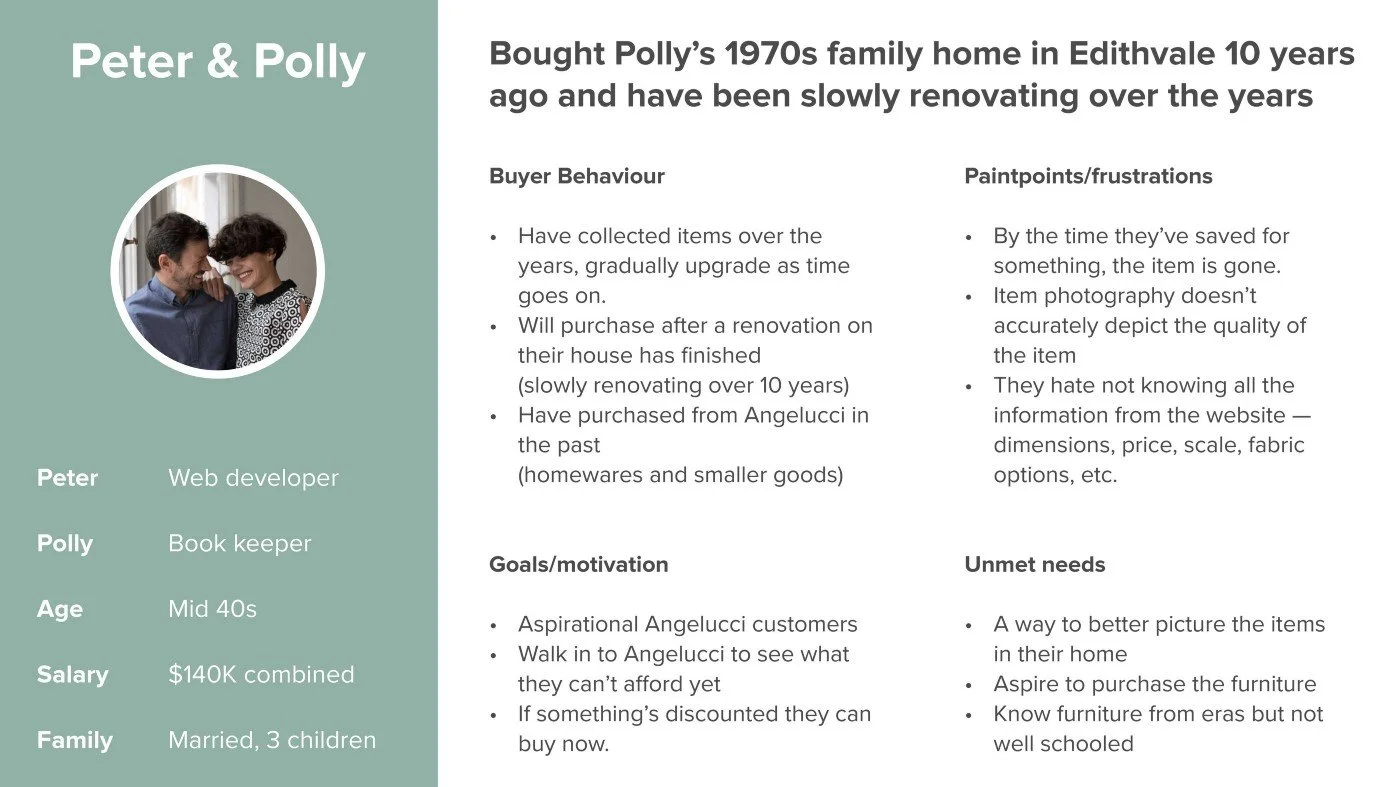
Above left: Annie, Angelucci’s primary persona. Above right: Peter + Polly, Angelucci’s secondary persona
Problem and hypothesis
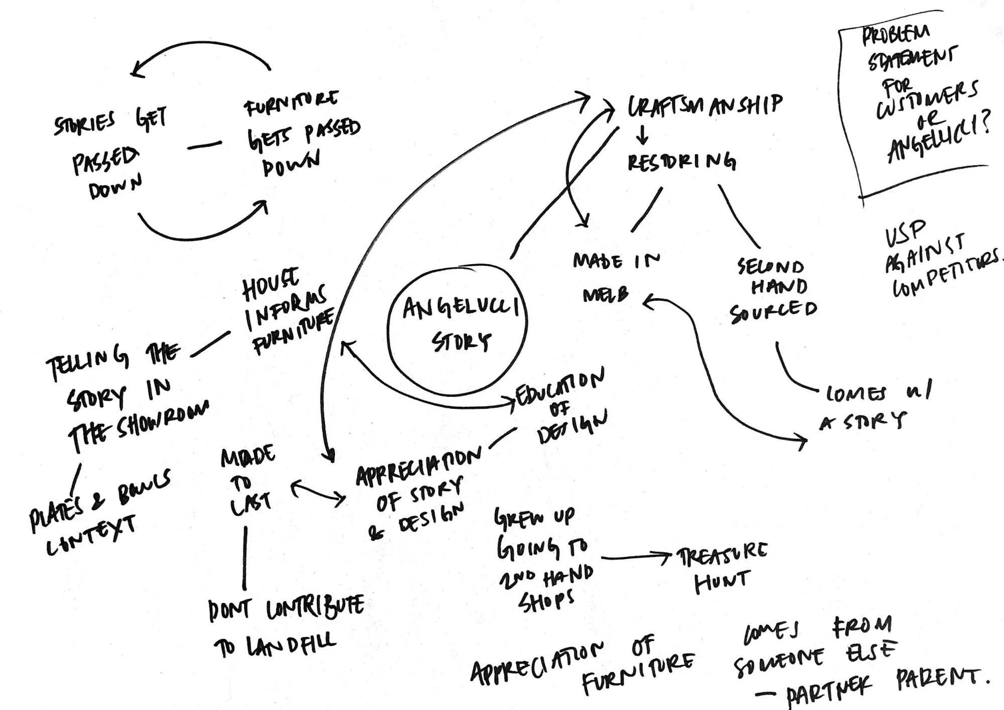
Through primary and secondary research synthesisation, I hypothesised:
Annie needs a better narrative about Angelucci and its products because the stories that come with them are at the heart of her love for mid-century design.
I asked, how might we provide Annie with a better Angelucci narrative?
We could provide a story behind:
the origin of each vintage piece;
each piece’s designer;
the Angelucci restoration process.
Solution conception and ideation
Understanding that Angelucci’s website needed a revamp, I began to ideate how I could do this by better telling their story and making their website more user-friendly.
In a contextual inquiry, I gave users the opportunity to search the Angelucci website for a sofa of their choice and then to see if they could enquire about that sofa.
The three biggest insights that came back:
Site navigation
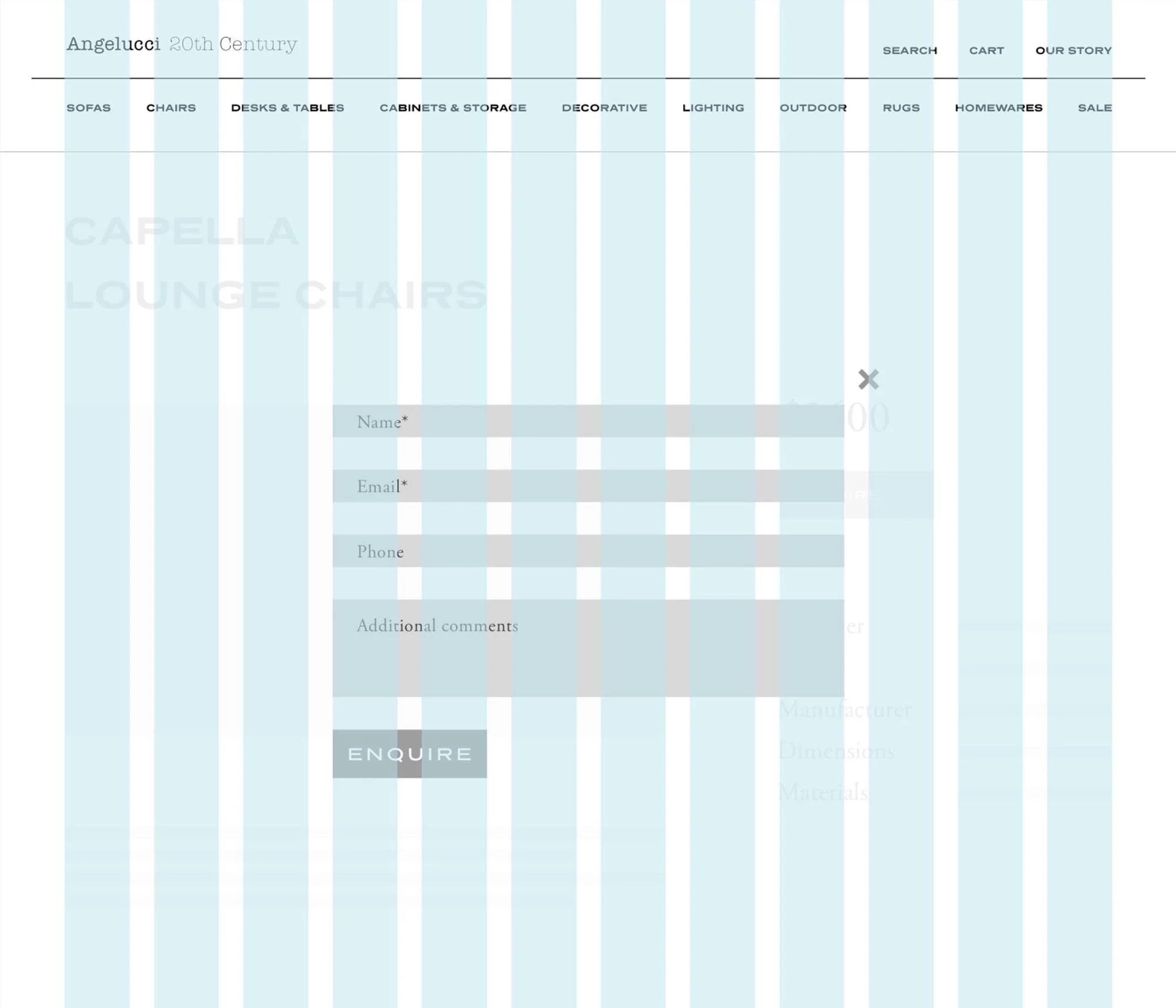
Users loitered in the site navigation looking for ‘sofa’ then realised it was under ‘vintage’;Email form
Users did not know what information to put in the blank email that popped up after they had hit the ‘enquire’ Call to Action (CTA).
“So what should I write here?”;CTA inconsistency
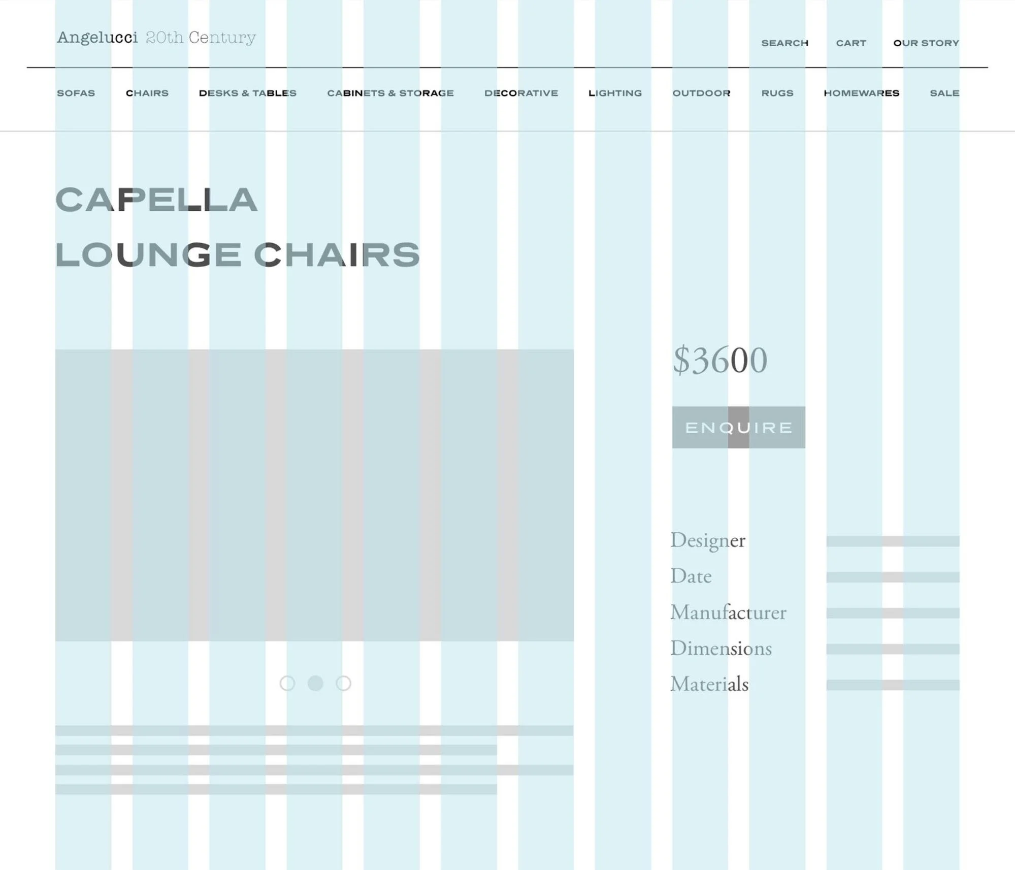
Users did not understand why some products had both a ‘shop now’ CTA and an ‘enquire’ CTA when you could only do one or the other.
Given these were the biggest insights, I revisited the information architecture, ‘enquire’ form, and consistency and standards in CTAs when redesigning the website.
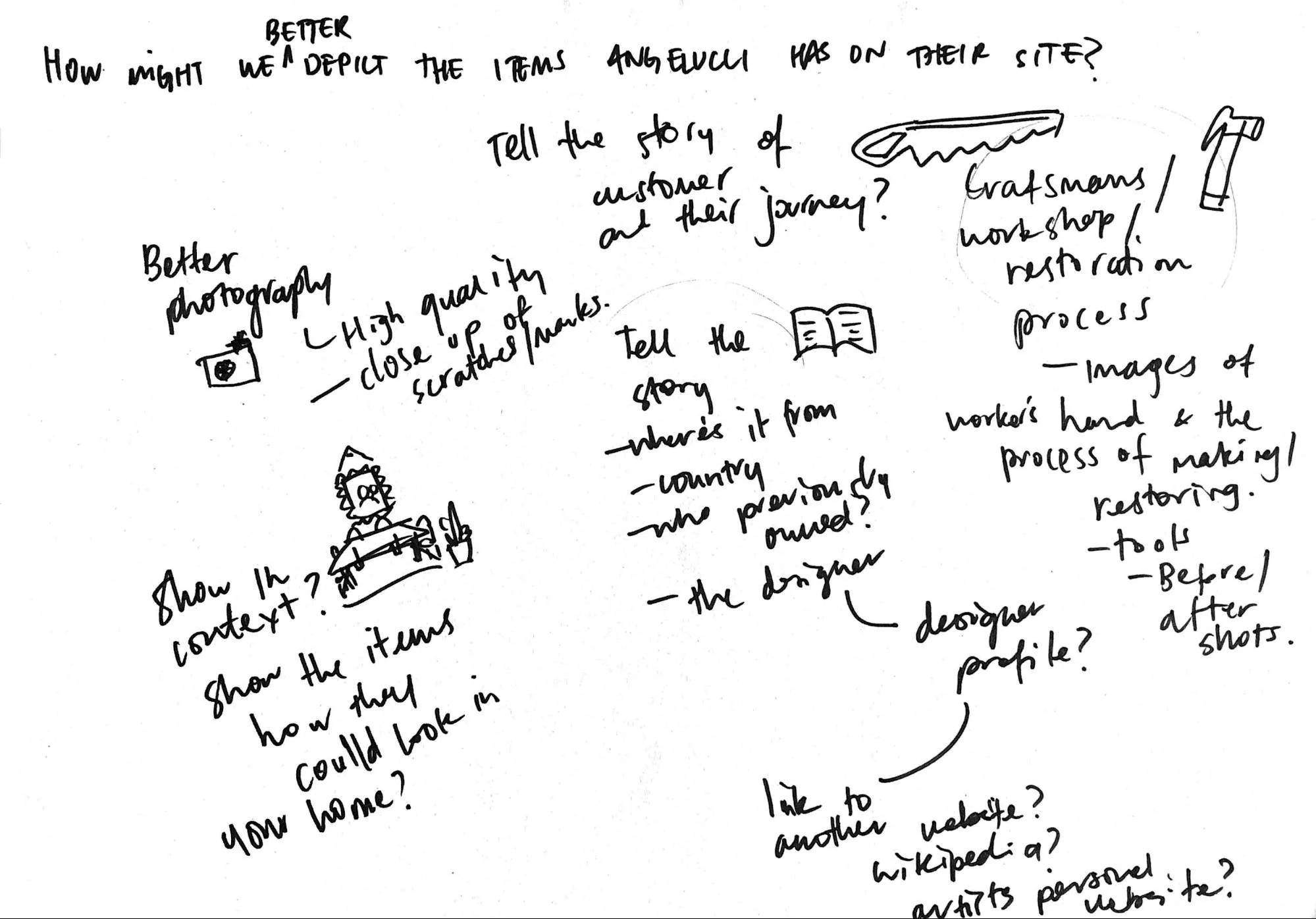
Above: Ideating how I could best tell Angelucci’s story
Information Architecture
Above: Old site navigation which was not user-friendly. The most viewed pages all sat under the top-tier menu item ‘vintage’.
Through a card sorting session with 5 users, I reordered their proposed site navigation. I was hesitant after receiving the results from users. Before, Angelucci had 6 items in its top tier of navigation. After the card sorting session, it looked like we were going to need around 9 or 10. I consulted Neilson Norman Group for advice around the rule of thumb for items in a navigation menu.
A larger breadth of top-tier navigation items are acceptable so long as:
✅ the e-commerce site sells a variety of different stock;
✅ the items in the navigation are meaningfully labelled;
✅ the user is browsing rather than seeking;
✅ and the navigation items are prioritised so that the most popular labels are at the start and end.
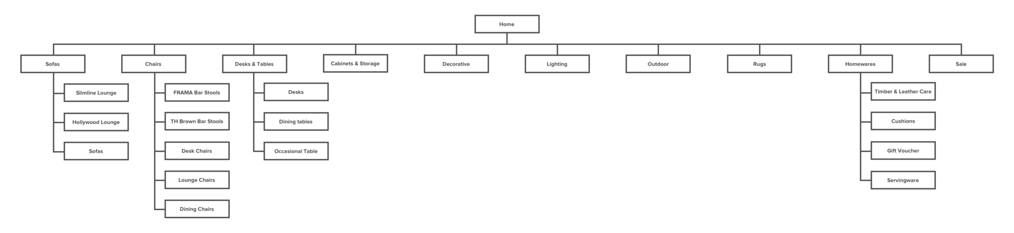
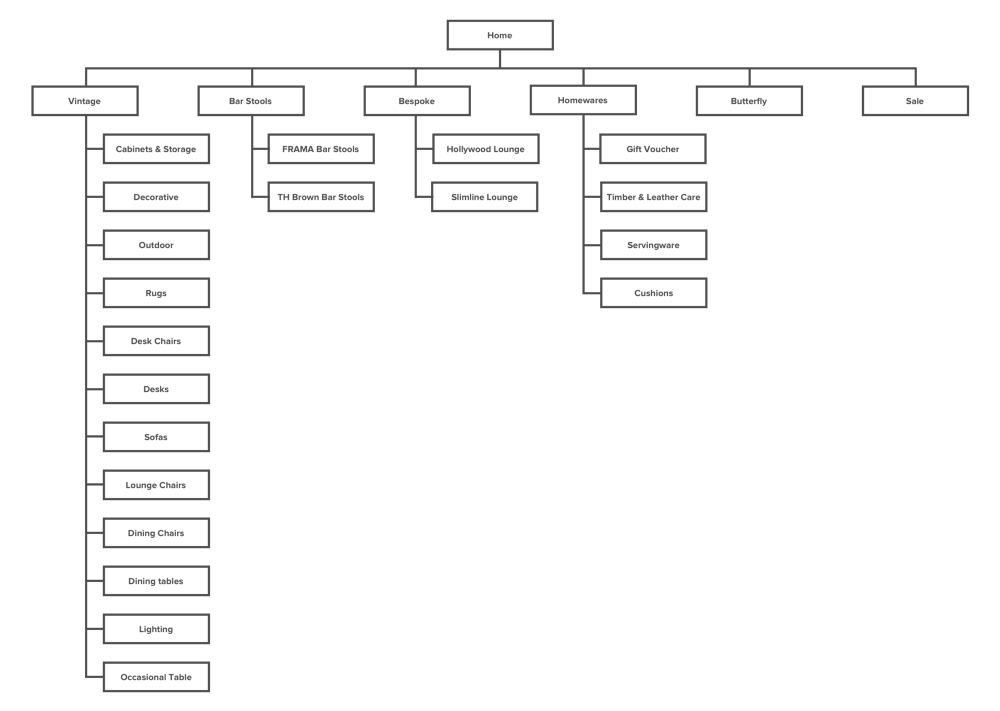
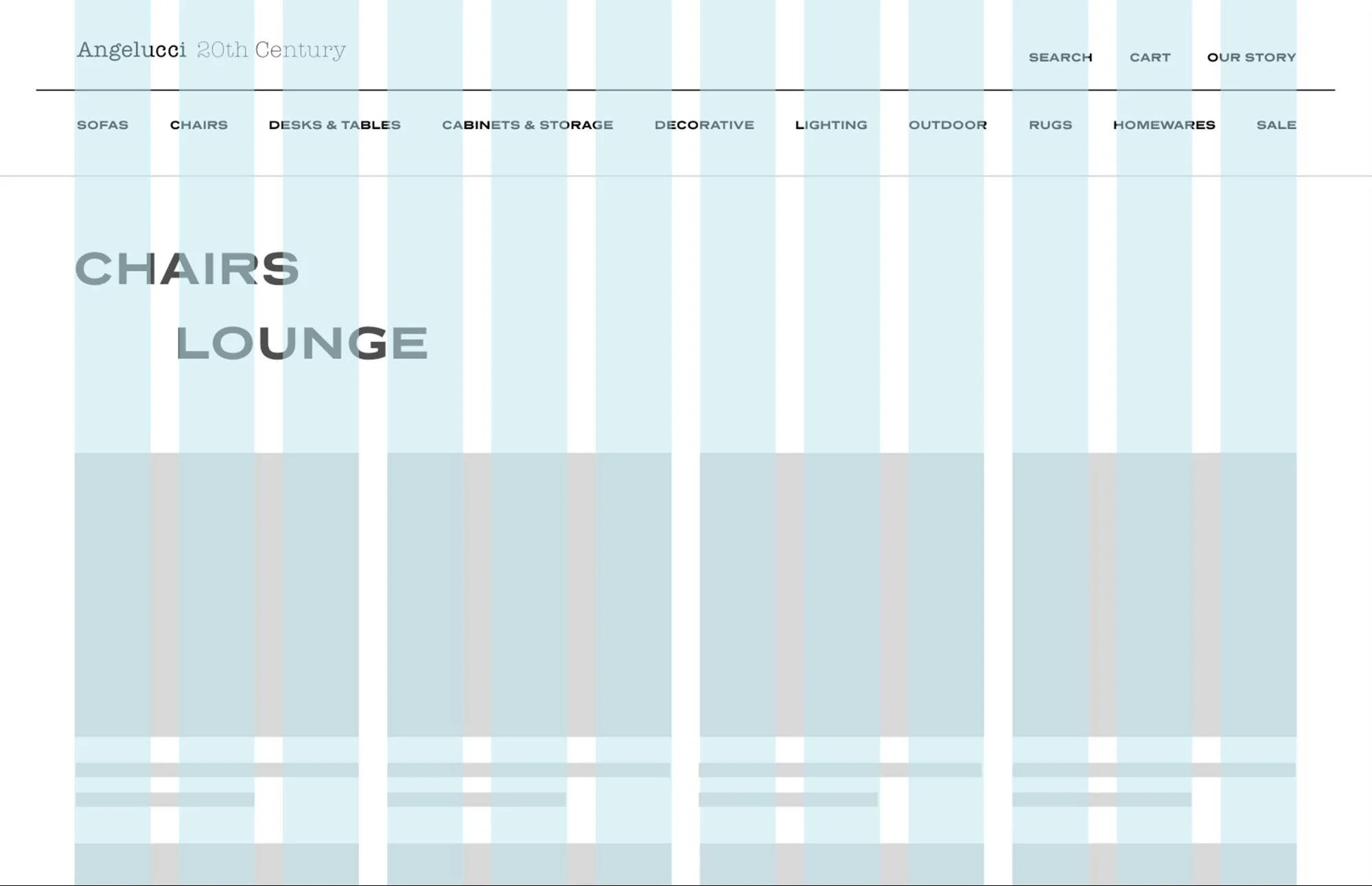
Above: New site navigation with a larger breadth and shallower depth, ideal for browsing rather than seeking
Developing the solution
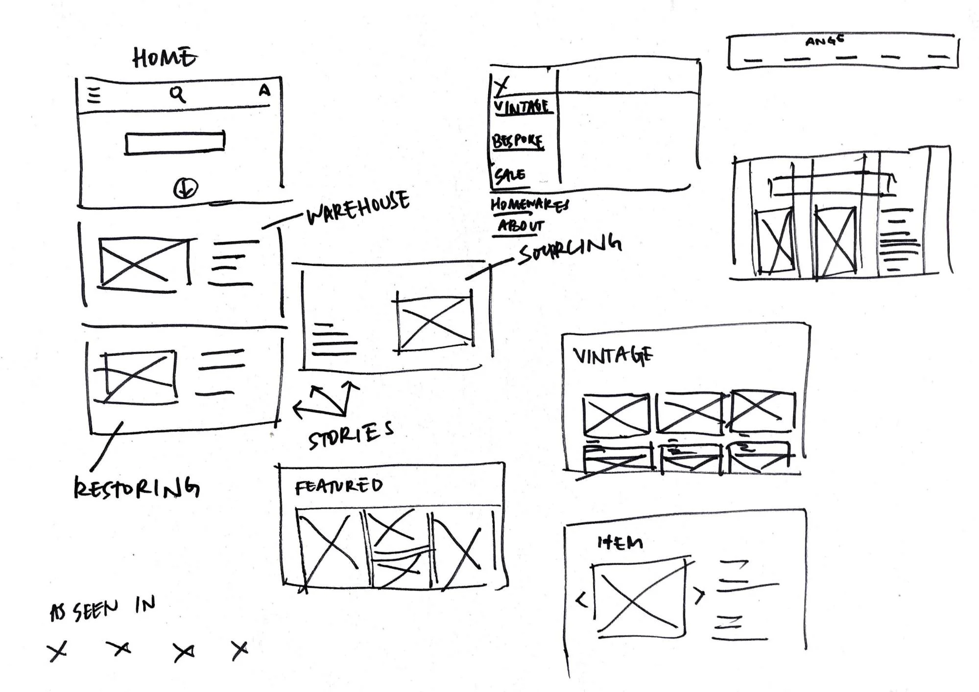

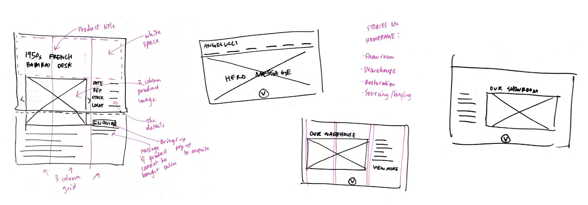
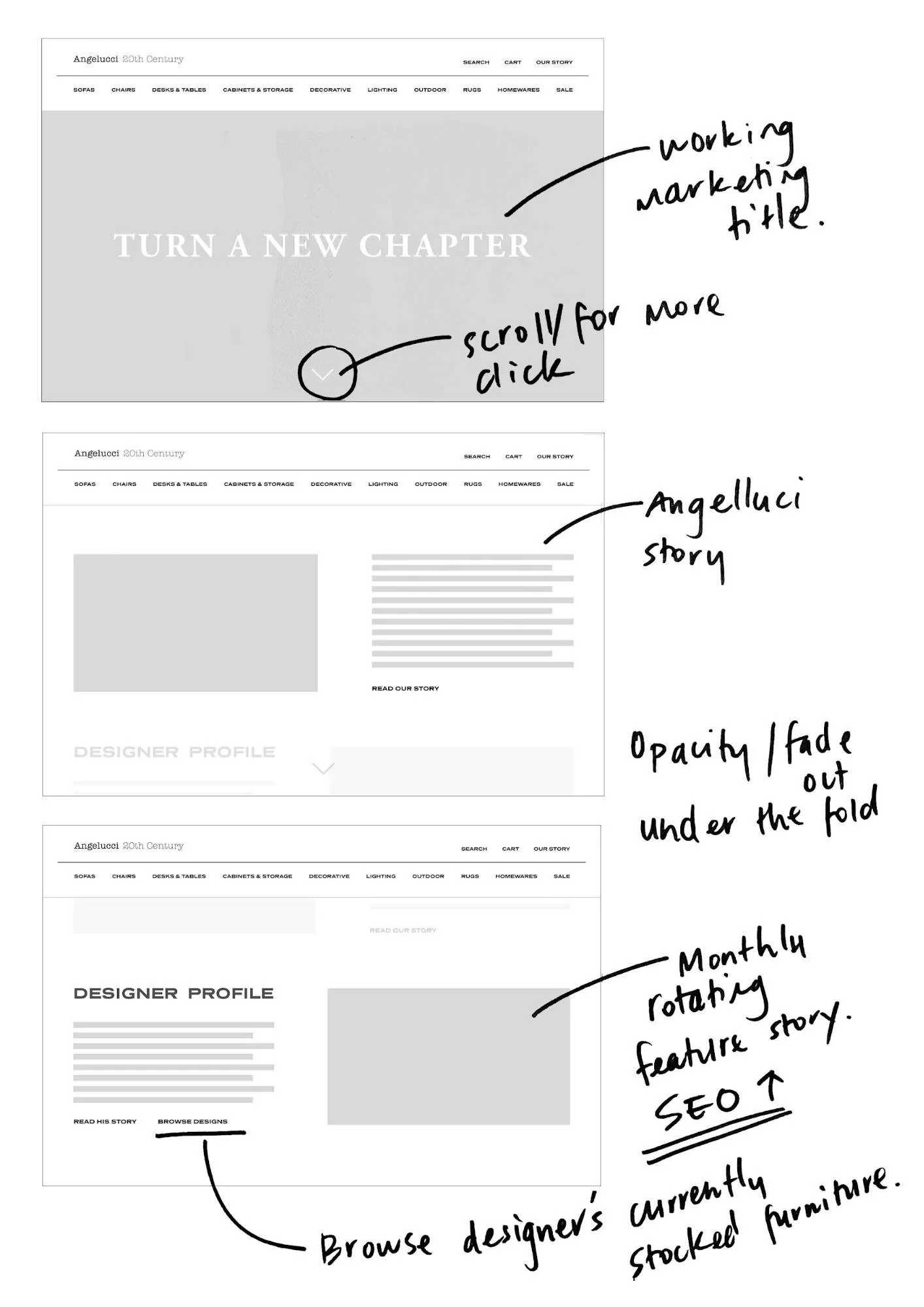
Above: Initial wireframing
I also brainstormed a bunch of ideas for a marketing message. Furniture store Jardan does this really well. Jardan cleverly sells its products around the message Made for Life, evoking a strong emotional need for well-made, comfortable furniture.
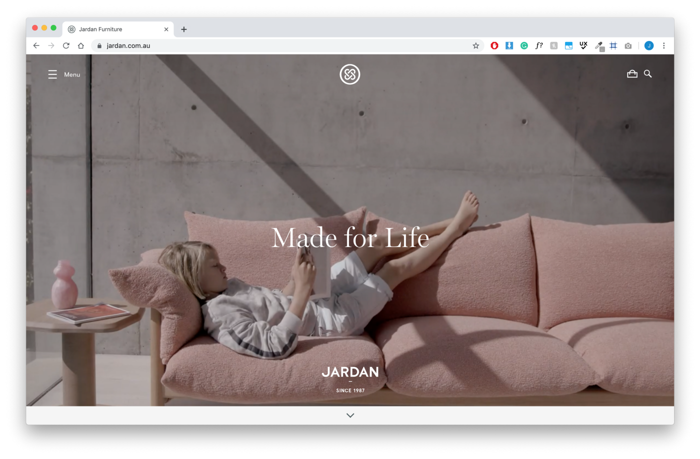
Above: Jardan’s messaging ‘Made for Life’ cleverly sells their furniture
I wanted the same for Angelucci — a strong message to sit over their hero image on their homepage. I wanted to this to further create a story that Annie could buy into. I started the ideating from the idea stories get passed down; furniture gets passed down too.
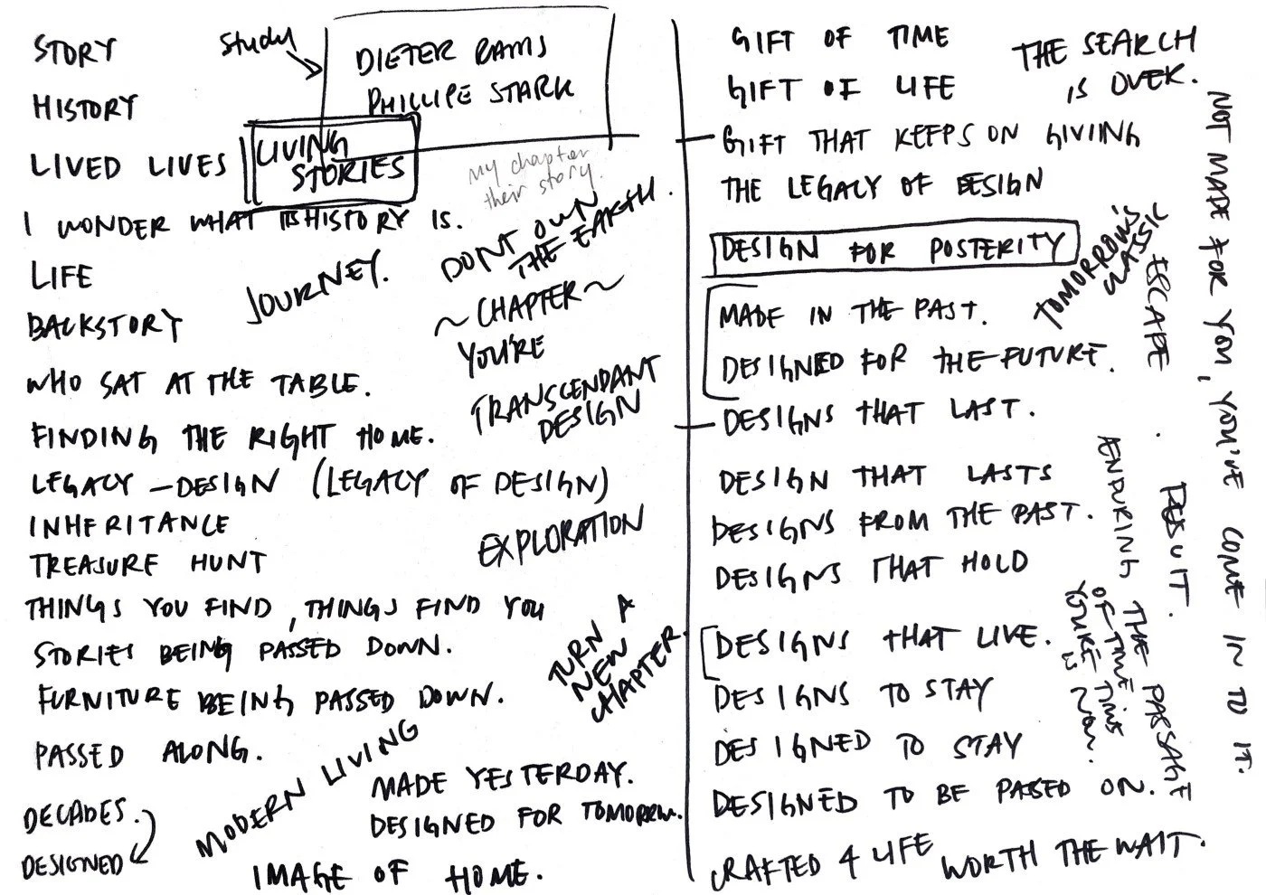
Above: Brainstorming a marketing message for Angelucci around the idea that stories get passed down; furniture gets passed down too.
Choosing a typeface
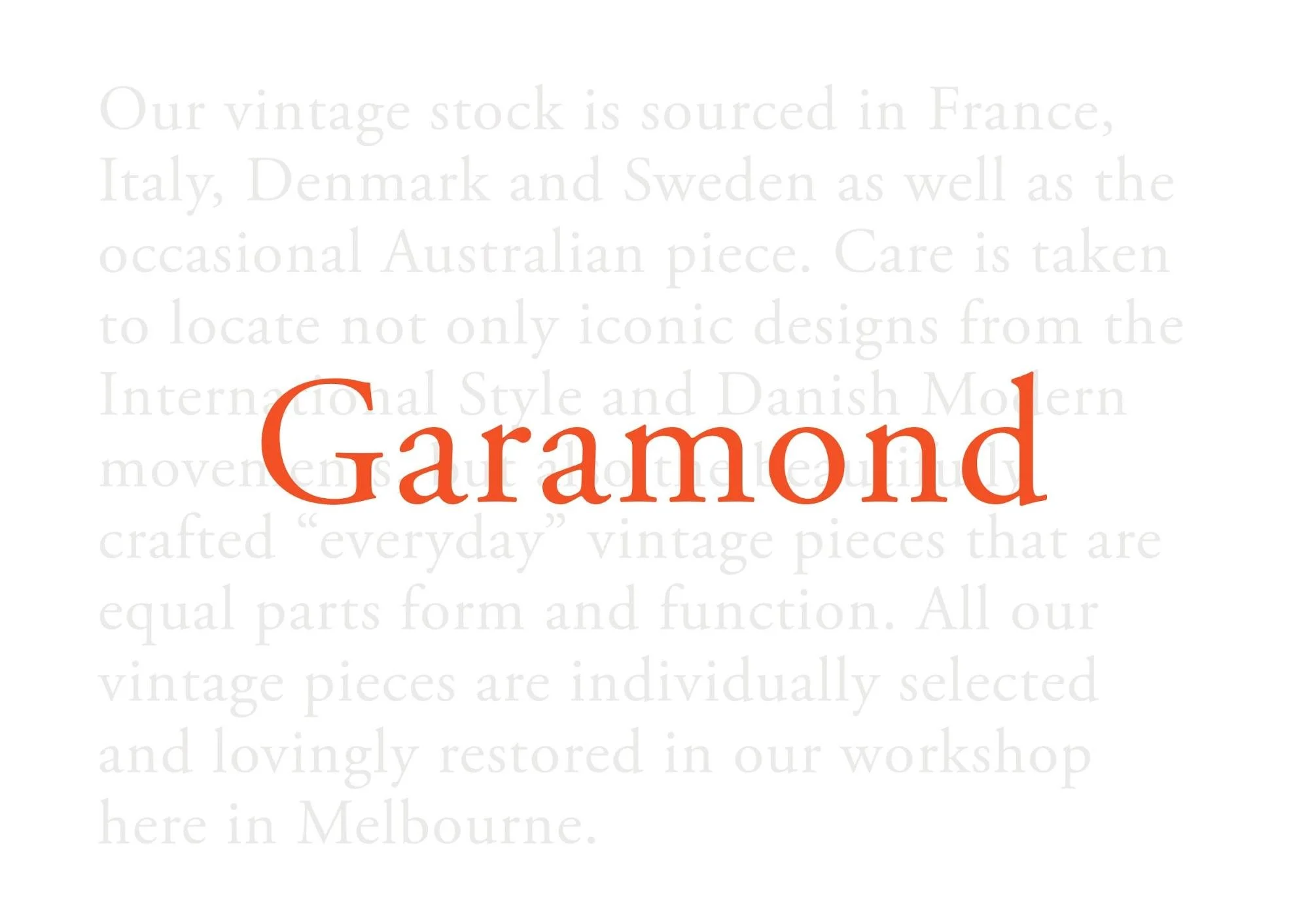
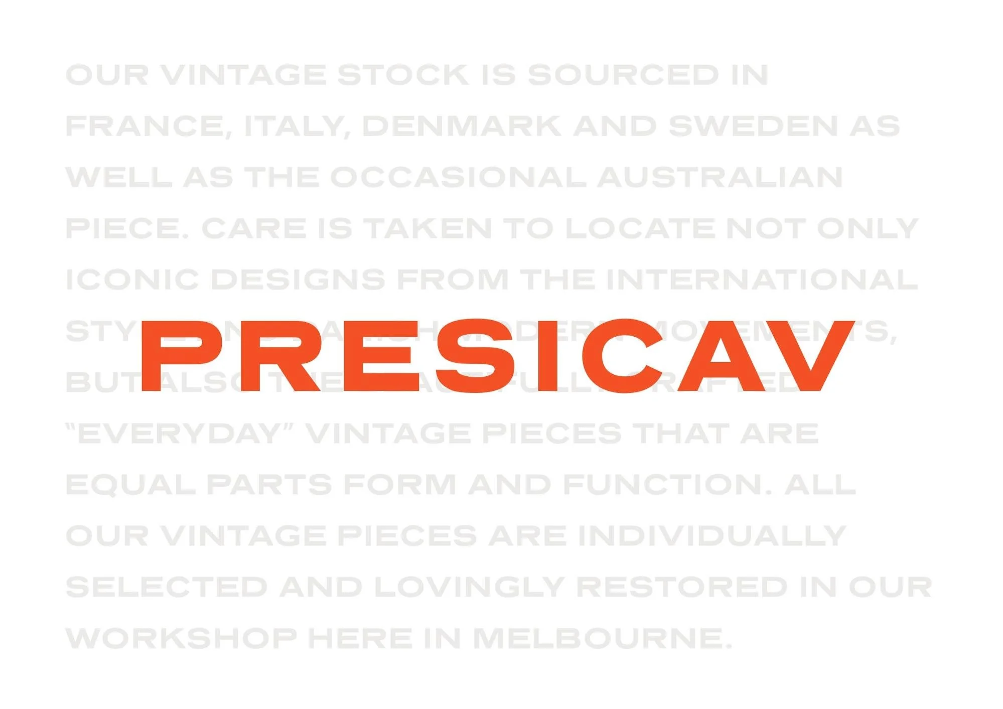
Above: Presicav and Garamond typefaces were chosen for the Angelucci website as a homage to mid-century aesthetics and publishing, respectively
Presicav
Presicav was inspired by quirky, wide mid-century typefaces. The lighter weighted fonts in this typeface have a contemporary finish. Presicav is a perfect type choice to bring together a mid-twentieth-century aesthetic in a modern twenty-first-century context.
Garamond
Garamond (officially Adobe Garamond Pro) pays reference to 16th-century Persian engraver Claude Garamond. Today it is a popular typeface in publishing and printing. This serifed typeface lives harmoniously with Presicav—its san-serif counterpart—to bring Angelucci’s website to life.
Making it digital
I used 12 columns on an 8-pixel grid for the skeleton of this website. A 12-column grid is handy because it's divisible by 1, 2, 3, 4, 6, and 12 which makes for a variety of ways to nicely and neatly align objects.

Above: 12-column 8-pixel grid system for the skeleton of the website


Above: Annotated wireframes showing interactions
Solving the problem
Redesigning Angelucci’s website solves their current problem in 3 ways:
It gives Annie a better story about Angelucci and its products
Information architecture is improved resulting in a more usable navigation
Enquiry CTA allows for a template to be filled within the website so users aren’t externally connected to their operating system’s mail application in order to contact Angelucci, thus keeping Annie engaged.
Next steps
Create a user login for individuals and business
As Alex had mentioned in the stakeholder interview, more trade based inquires (architects, builders, designers) would be desired in the future. A user account system could help make this a more usable experience by potentially merging the ‘enquire’ function within the user account feature.
Challenges
Not having immediate access to Angelucci’s customer database proved quite challenging at the start. Finding people who shop for vintage furniture was not an issue — but these people seemed to be more of the bargain hunter type. Appreciative of mid-century design aesthetics, yes. Willing to spend in excess of $5,000 for a vintage sofa, pre-worn and pre-loved? Probably not. Organically finding Angelucci’s true customers was difficult. But something quite serendipitous happened. The thing about this demographic of a consumer is, once you find one, it dominos. Mid-century design aficionados don’t see this hobby; it is a lifestyle. And they have friends who are a part of this lifestyle too. You speak to one person, who can put you in touch with someone else, who knows someone else.
As the project pace was slowed by the initial difficulty in finding participants to interview, this project only went through one round of usability testing. Given the time constraints, this isn’t something I would change. I believe that finding the right users made for a solid foundation for this project.
Learnings
In this 2-week project, I learned the importance of working as part of a team. Working solo meant that I wasn’t able to rely on team members for the sound-boarding of ideas. It also meant I wasn’t able to receive feedback backed by a deeper knowledge of the entire project and all its variables. It made me realise that there may have been opportunities I missed due to the lack of input and insight from others.
I also learned that a strong and clear pathway can be paved for the project through the identification of a specific demographic of users. I noticed that because the vast majority of Angelucci users I interviewed had similar goals, motivations, pain points, and buyer behaviour, it made for a clearly defined synthesisation of research. Very soon into the primary research, I noticed most people spoke a similar narrative.